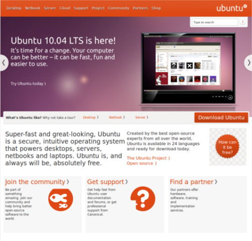
Canonical has launched the new Ubuntu web site and it is a beauty of a site. I must say Canonical(Ubuntu’s parent company) is giving it everything its got because the new web site compared to the old one is a dream. Its got style and is using the latest web design trends. I must say I love the way they are using their color palette.
Everything on the site seems to be in sync and it has a very good use of Javascript to convey its main operating system presentation. It also clearly outlines all the sites sections and it has a very nice and well placed search box. I my opinion this site rivals Apple.com and I believe that in some ways is better.
They have also added some new sections with some great content; or dare I say if they were there before I never saw them before.
The main page clearly conveys all the information visiting users should see and learn about the Ubuntu project.
It also gives you a clear distinction between the different versions of the operating system and what each one is to be use for. It also gives users a much faster way to get to the download section for all versions. They are also featuring the Ubuntu Netbook version which we never got to see in the previous site; Now they are making it a point to highlight all the possible solutions which one can achieve by running/using Ubuntu.
They have also included a Case Study section which was much needed and their footer allows you to get to everything.
The one thing I don’t like about the site is that is not very handicap friendly the developers seem to have forgot to add Alt and Title tags to the site links and images. But overall is a very small “oops I can’t believe we for that”.
I for one welcome their new marketing strategy and brand redesign!
Here are some more screen shots and let us know what you think about the sites redesign.


